- About
- Current Experience
- User Research
- Persona
- Interview Process
- Problem Statement
- Solution1- Efficient IA
- Solution2- Hierarchy
- Figma Prototype
- Results
- Reflections
AmazingTalker
Redesign
Redesign
UX case study and UI redesign
for language learning iOS app
🕒 2022 Dec - 2023 Feb
📗 Solo Passion Projects
👨🎨 UX researcher + Visual Designer
🏷️ Language Learning app
📗 Solo Passion Projects
👨🎨 UX researcher + Visual Designer
🏷️ Language Learning app
About Amazing Talker
AmazingTalker is a language learning app featuring diverse teachers and flexible scheduling. It offers basic conversation practice as well as advanced classes for business and interview preparation.
Current experience
This redesign project stems from my personal experience. Despite using the app for over a year, I have consistently faced difficulties in finding the things I need efficiently.
Surprisingly, some of my friends have encountered the same problem.
"I like the essential functions,
but too much irrelevant content."
— User A (31)
“Checking my class time shouldn't be this complicated!
It's a real struggle to find what I need with the confusing structure.”
— User B (24)
User Research
In Taiwan's thriving adult English education market, young professionals with language learning subsidies are a significant demographic.
In this research study, I enlisted the participation of five young professionals who were frequent users of AmazingTalker. The primary objective was to gather their experiences and insights regarding the app's usability. The research process involved sharing their personal experiences with the app and completing preassigned mobile tasks. Each participant's involvement took approximately 40 minutes in total.


Persona of a typical AmazingTalker user
I created a user persona of target user and visualize various aspects of their behavior and motivations. This persona was roughly based on the users interviewed during the usability testing.
The Processes of interview

Some steps they did and the questions they asked.
Part 1 Questions:
︎How often do you take language learning classes?
︎When you do, what is your motivation for doing so?
︎What challenges do you face in the whole process?
How does this make you feel?
︎Is there any way in which you feel these challenges could be resolved?
︎What do you want to see first as you open the app?
︎Which function do you use most or most useful?
︎Any thoughts or problems with the experience?
The tasks in Part 2 :
︎Find your last class and review.
︎Find your incoming clas.
︎Find the lasted notification.
︎Find the message.
︎Navigate to teachers you saved.
︎Navigate to your purchase history
︎Access to the shorts video page.
︎Let’s go through the booking processes ( stop before you pay.)
What users said:
“I usually put the classes in my reminder rather than in AmazingTalker app.”
“Uhh…I am a little confused.”
“Should I go to my profile first?”
“Is the notification here? There is a number here.”
“Should I find the history and get into that class information?”
Through these questions, I found that most of them are in two situations, with different purposes for using this app:
① They have bought some sessions and stably taking the classes from their tutor
→ They care whether they can easily check the calendar, notifications, and teacher’s messages.
② They are looking for a new tutor
→ They care whether the teacher’s information fits their requirements.
Analysis Questions
2x2 Matrix
These questions were found through user testing, and I used the 2x2 matrixes to prioritize them. This
method helps me better understand how important these issues are to customers and the AmazingTalker company.
At the same time, it also helped me prioritize which problems to tackle first. After these steps, I defined the two pain points and proposed solutions.
At the same time, it also helped me prioritize which problems to tackle first. After these steps, I defined the two pain points and proposed solutions.

Problem Statement
By conducting interviews and usability testing, I identified two pain points:
・Unclear navigation
・Unintuitive user journey
Here are two examples to show what the users are most confused about:
Confusing home page
On AmazingTalker, the home tab's presentation can be confusing, with learning resources and tutor sections interwoven in a way that makes it challenging for new users to read the content effortlessly.
Difficulties in Checking Notifications
Amazing Talker current design presents a usability problem: To check notifications, users must navigate through the
➊ bottom message tab
(click the “message” tab)
➋ top navigation bar
(switch to “Notification”).
This unintuitive and time-consuming steps, leading to dissatisfaction and confusion.

In response to these findings,
I proposed two solutions to tackle the problems. 👇
Solution 1
Efficient Information Architechture
👉 Reorganize the pages in a intuitivel way.
👉 Renew the content in tab bar.
1-1. Regroup functions & New information architecture
To improve the usability of the app,
I made two changes to the information architecture.
1.
First, I moved the "Message" and "Notification" buttons from their original location and placed them on the Home page. I arrived at this decision after researching some Navigation bar document and finding that this placement would be more intuitive for users. By doing this, users can access their messages and notifications more easily, without having to navigate to a separate tab.
First, I moved the "Message" and "Notification" buttons from their original location and placed them on the Home page. I arrived at this decision after researching some Navigation bar document and finding that this placement would be more intuitive for users. By doing this, users can access their messages and notifications more easily, without having to navigate to a separate tab.

2.
Upon reviewing the original information architecture, I noticed that several functions were seperated in the different tabs.To improve it, I regrouped the functions based on their relationship. For instance, "Discount," "Tutors," and "Learning Resources."
Base on these groups and two senerios I found in the user reaserch, I created new four tabs to organize these function groups better.
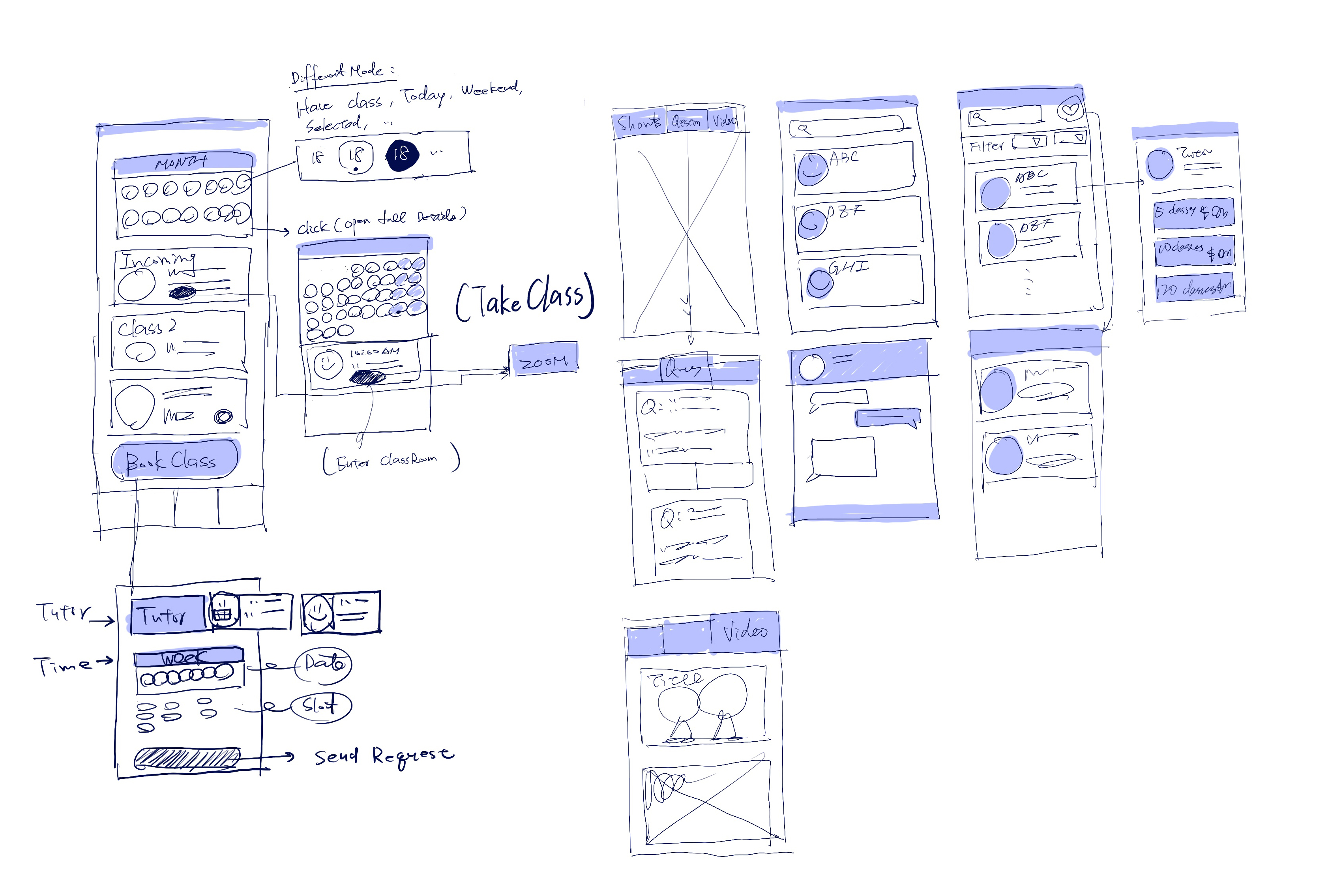
1-3. Interaction Map and Wireframe
Base on two senerios I got from the interviews and the new information architechture,
I outlined the Interaction Map and the Wireframe to figure out the flow and what elements I will need in these pages.

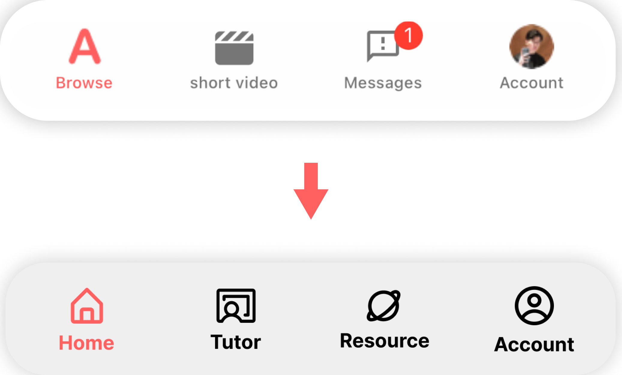
1-4. Develop New Tab Bar

To better serve our users, I separated the tutor-related functions, such as
searching for a tutor and favorite tutors, from the calendar and course-related functions. This way, users can
more easily navigate the system and find what they need.
Second, I updated the tab names based on the new groups of functions to make them more intuitive. This change ensures that users can quickly and easily find what they need.
Second, I updated the tab names based on the new groups of functions to make them more intuitive. This change ensures that users can quickly and easily find what they need.
1-5. Result:
Before / After
Solution 2
Comprehensive Hierachy
👉 Top navigation bar
👉 Card system
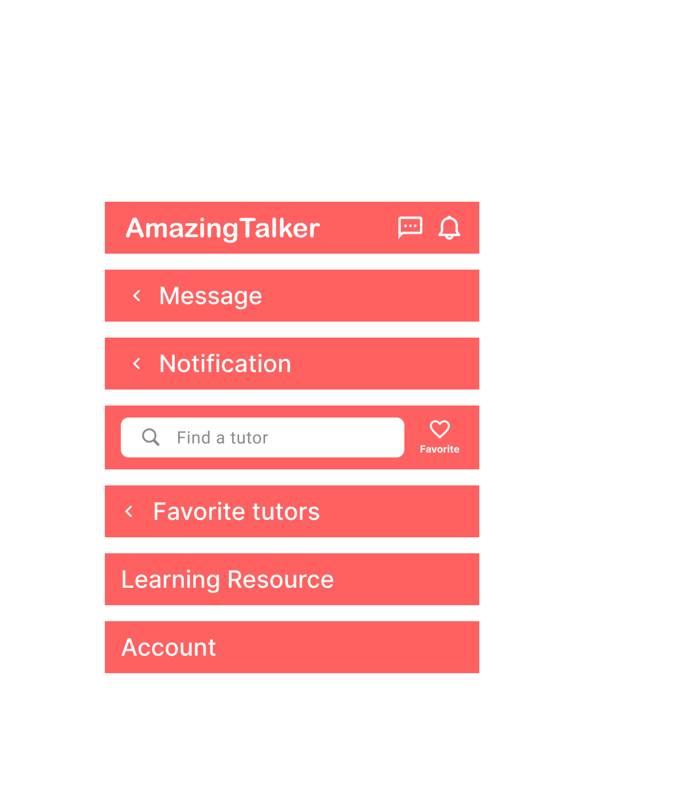
2-1. Top Navigation Bar
I added a modified tab bar to the app. Unlike the original version, this new tab bar includes indicators that show users their current location within the app. By doing this, users can easily keep track of where they are within the app and navigate to other areas more quickly.
2-2. Card System
I implemented card structures and unified style text titles across all
sections of the app. This change provides greater clarity and consistency when users search for information
across different sections.
Furthermore, this design approach makes future updates or content additions easier to implement. By establishing a unified structure and style, new content can be added more seamlessly, without the need for significant design changes. This enhances the scalability of the app and ensures a smooth user experience for future updates.
Furthermore, this design approach makes future updates or content additions easier to implement. By establishing a unified structure and style, new content can be added more seamlessly, without the need for significant design changes. This enhances the scalability of the app and ensures a smooth user experience for future updates.
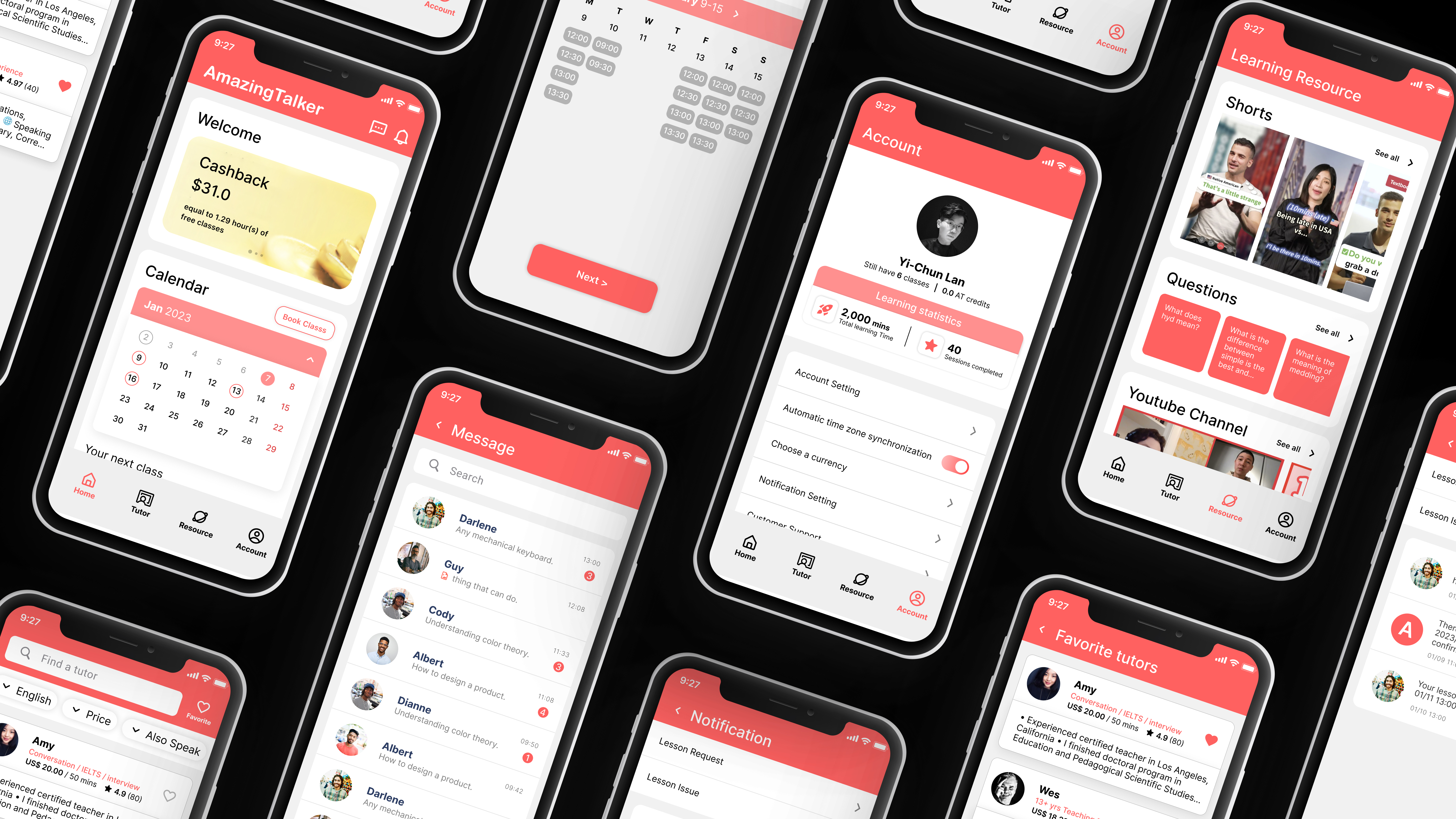
Figma Prototype
Test the prototype here!
Before
⬆ Working Prototype! ⬆
Scroll to see the original design.
Scroll to see the original design.
After
⬆ Working Prototype! ⬆
Scroll to see the difference.
Scroll to see the difference.
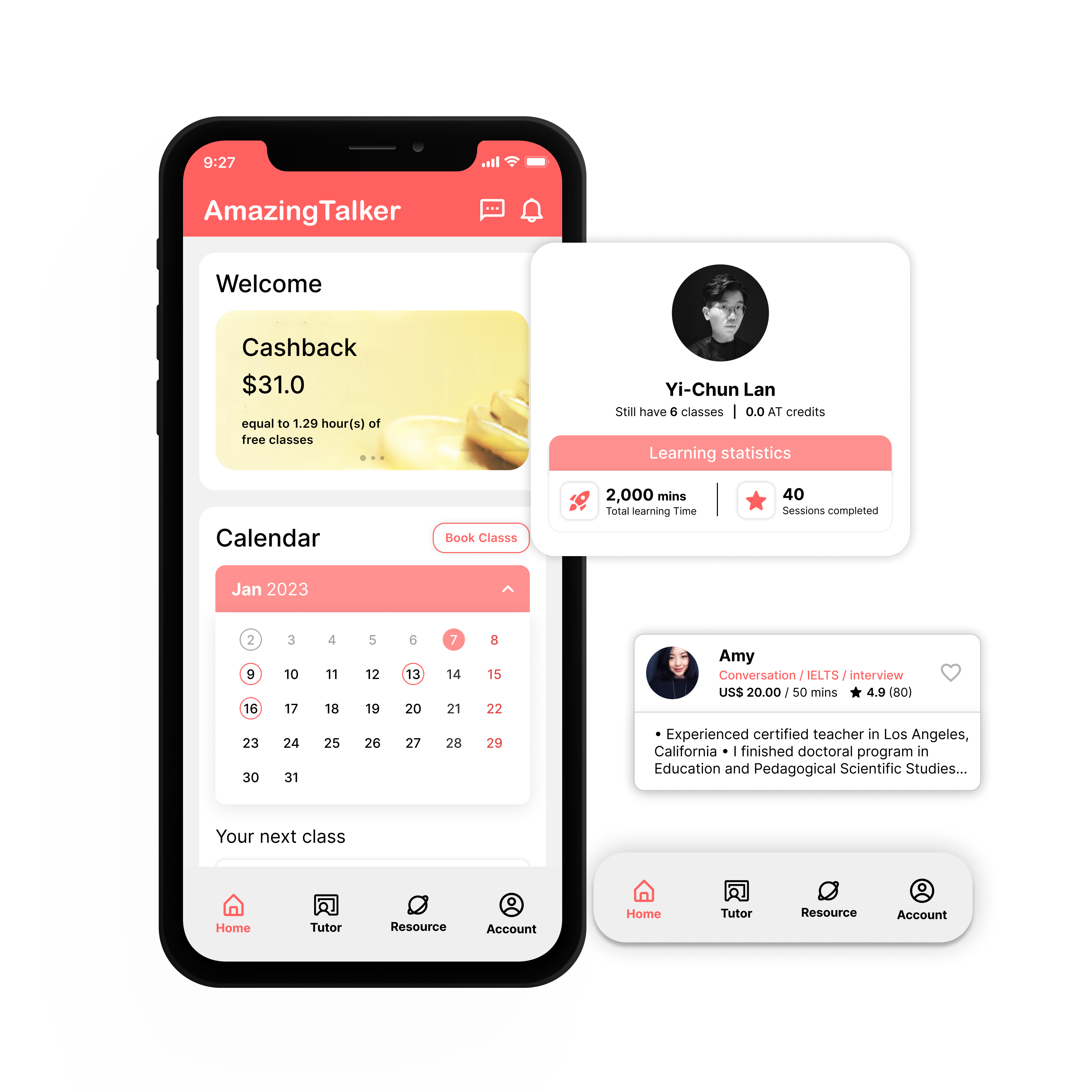
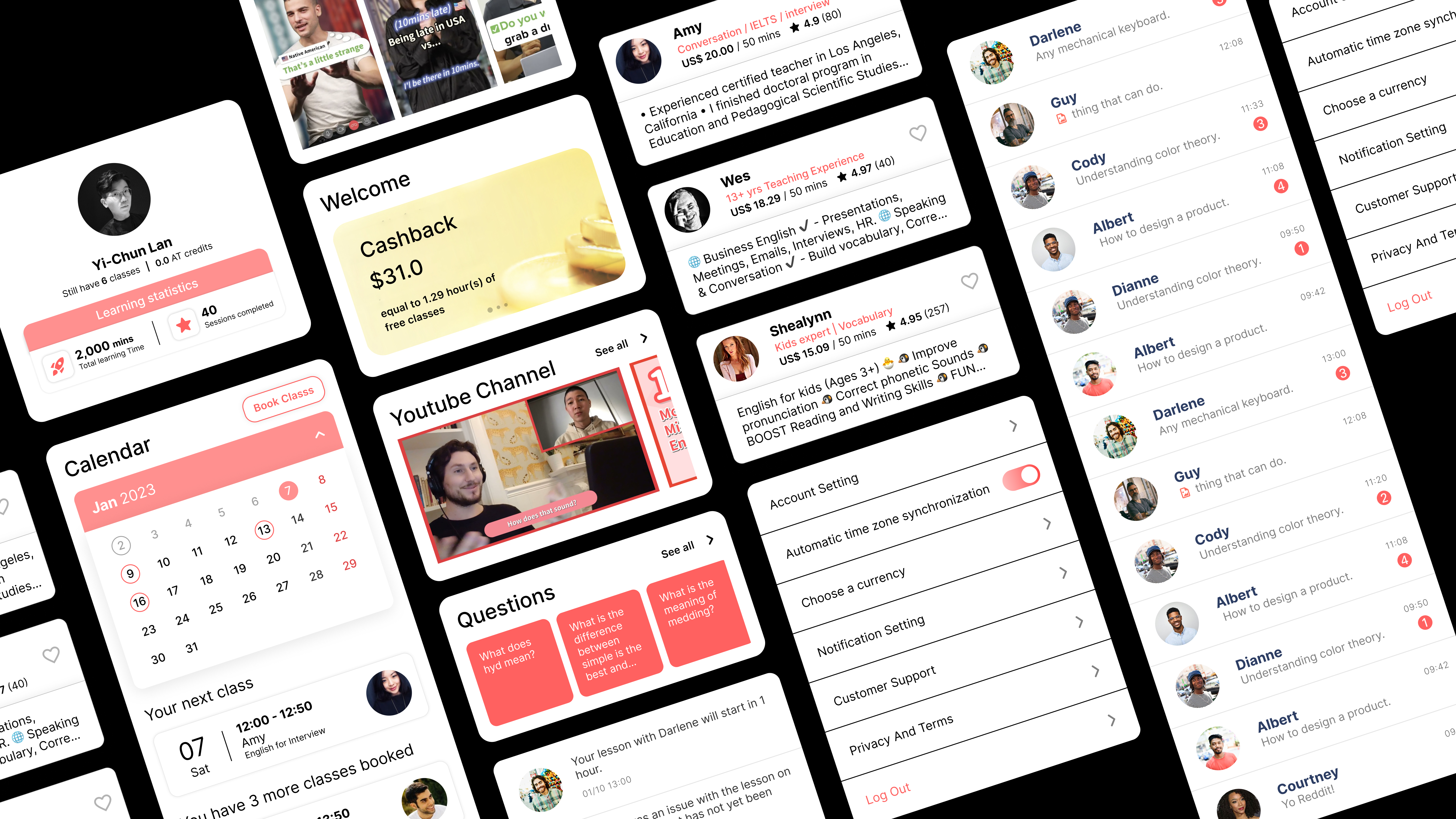
Home
To balance the needs of the user and the business, I kept the discount and course-related content sections on the page, as they are crucial for users.
Welcome Card
Within the discount section, I created a card that includes cashback, referrals, and coupons, which displays prominently at the top of the homepage. This ensures that users can easily find and take advantage of the best prices available in the app.
Calendar Card
Based on user research, I found that the calendar, booking classes and checking incoming classes are essential for users.
Message & Notification
I also relocated the notification and message to the top navigation bar, making them more easily accessible for users.

Tutor
To make it easier for users to find and save their favorite tutors, I created a new "Tutor" tab in the app.
This tab includes all the sections that can lead users to the tutor's page in the original version, but now users can access them all in one place.

Learning Resource
During usability testing, several users commented that they would appreciate having a dedicated section for the app's learning resources.
One user even commented that they would use these resources during their commute if they were easily accessible. Taking this feedback into account, I rearranged the app's learning resources and created a dedicated tab for them on the bottom navigation bar.

Account
To motivate users to keep learning, I added a new card to the app that displays how many classes and minutes the user has already completed. This feature provides users with a sense of accomplishment and encourages them to continue using the app.
Additionally, to keep the app's interface clean and organized, I removed some repeated functions that were previously available in other tabs. This helps to streamline the user experience and keep the app's main functions easily accessible.

Reflections
I am thrilled to work on this project because I have used this product a lot. I recognized this as an excellent opportunity to further develop my design skills by engaging in the design processes of this project. I hope that my enthusiasm for this endeavor has come across and that you have enjoyed learning about it as much as I have enjoyed working on it.
As always, I welcome any feedback you may have, and thank you for taking the time to read about my journey in the process.